
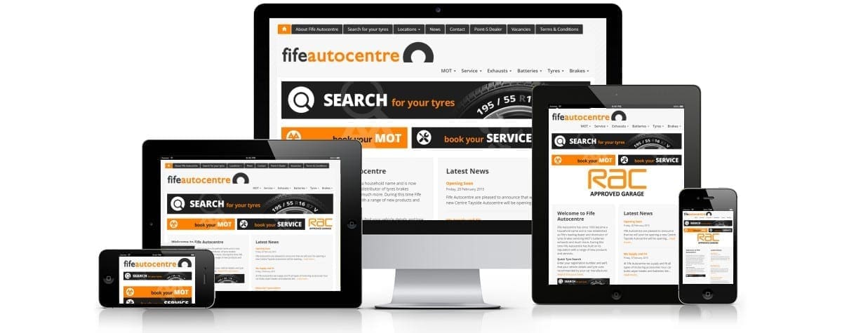
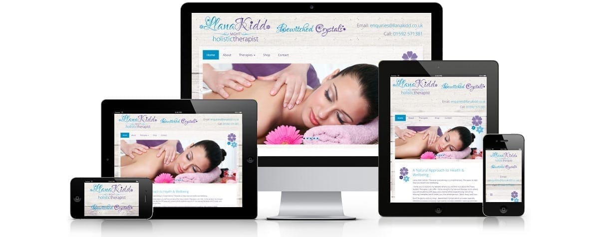
Responsive Web design suggests that design and development should respond to the user and operating environment. This is largely based on the screen size, platform and orientation in which you are viewing the site. In other words, your website would look just as good on a mobile phone as it would a desktop computer.
With the advancement of technology and smartphone focussed era, it comes as no surprise that over half of internet searches now take place on a mobile device. When a potential customer lands on your website, it takes them less than a second to form an opinion based on design and first impression. The last thing you want is a high bounce rate because mobile device users cannot effectively view your content.
Benefits of Responsive Web Design
1. Flexibility
The website content is developed fully adaptable and flexible for effective viewing from one screen to the next. This means all users can access your website to its full capacity from any type of device without dealing with slow loading times or zooming to view content.
2. User Experience
Even if your website contains fantastic content, it’s of no use to your users if they cannot view it effectively on mobile devices. An unresponsive website would require the user to pinch and scrape on their device to view content, zoom in on text and unsuccessfully try to click on those tiny links. A fully responsive website is dynamic and automatically displays itself in the most user friendly format to eliminate these troubles. If your users enjoy the experience, they’ll be more likely to come back.
3. Better SEO
In April 2016, Google owned nearly 90% of search engine market share which means they are the highest influencer when it comes to search engine optimisation. Google officially consider mobile friendliness of a website as an integral part of their ranking algorithm for mobile search results.
4. Lower Duplicate Content
The Panda update in Google’s search ranking algorithm means that duplicate content can seriously affect your rankings. Those with separate sites for mobile and desktop are at risk of running duplicate content, especially now that Google is including mobile-friendly sites into their rankings. However, one fully responsive website reduces the risk of duplicate content.
5. Lower Bounce Rate
Nearly 50% of website users have difficulty using static, non-responsive websites. Viewing a static website on a mobile device significantly affects visual appearance and user experience, in turn causing negative affects such as increase bounce rate. A responsive website design can reduce this bounce rate by displaying itself in the most user friendly form.
Not only is a responsive website beneficial in terms of user experience and search engine optimisation, but they’re also cost effective because there is no longer a requirement for stand alone mobile websites. It’s a no-brainer.. let us help take your business to the next level with a responsive design that rivals your competitors whilst meeting your needs and requirements.
Read more on Website Design and Responsive Websites at Internet Creation
Internet Creation Ltd. specialises in Web Design & Development, Graphics Design and Digital Marketing (SEO & PPC). For more information on how we can help your business, email [email protected].


