
It is often frustrating to find oneself browsing a website that is not responsive i.e. mobile-friendly. Such websites typically consist of small texts, tiny links, and pages which are generally too wide and very difficult to scroll. In the vast majority of non-mobile-friendly websites, they are direct duplicates of their desktop version and look exactly the same when viewed on a computer or smartphone. However, there are reasons why websites are originally designed for desktop devices therefore every website should have a mobile-friendly version that is compatible with the smaller screens found on mobile devices.
Below are a few reasons why you should employ responsive web design on your website. With a responsive website;
- It makes it easier for users to share and link to your content with one URL.
- It helps Google’s algorithms to accurately assign indexing properties to your web pages.
- It requires less engineering time to maintain multiple pages for the same content.
- It reduces the possibility of the common mistakes that tend to affect mobile sites.
- It requires no redirection for users to have a device-optimized view, thereby reducing load time.
- It improves crawl efficiency by saving resources when Googlebot crawls your website.
In addition, according to Google, a mobile-friendly website should meet the following criteria:
Avoid software that is not common on mobile devices, like Flash
Use text that is readable without zooming
Size content to the screen so users don’t have to scroll horizontally or zoom
Place links far enough apart so that the correct one can be easily tapped
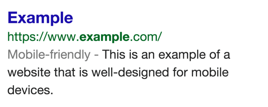
Furthermore, in a bid to help users find mobile-friendly websites more easily and improve their interaction experience on mobile devices, search engines such as Google have started rolling out a feature that adds a “mobile-friendly” label to mobile search results, as shown in the image below. Consequently, websites that do not optimise their content for mobile devices can expect a drop in traffic from an SEO perspective. This is based on the assumption that the average mobile search engine user would rather click on a mobile-friendly result than not.
Fortunately, you can now check your web pages to make sure they meet Google’s mobile-friendly criteria. To do so you can do one of the following:
- Carry out a Google Mobile-Friendly Test
- Learn to create and improve your mobile website with the Google Webmaster Mobile Guide
- Use Google’s Mobile Usability Report in Webmaster Tools to highlight potential usability issues
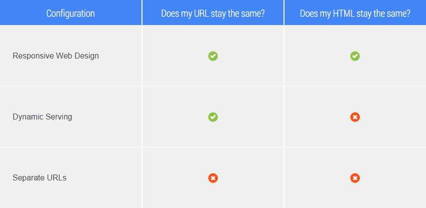
- Migrate your site to a mobile-friendly content management system (CMS). In general Google supports 3 main configurations of mobile-friendly sites as shown below.
Alternatively, if you are still unsure of the steps that should be taken to ensure your website complies with Google’s mobile-friendly policy, you can contact Internet Creation’s Mobile Solutions department for more information on how a mobile-friendly test can be carried out on your website and/or additional information on making your website responsive.
Internet Creation Ltd. specialises in Web Design & Development, Graphics Design and Digital Marketing (SEO & PPC). For more information on how we can help your business, email [email protected].

