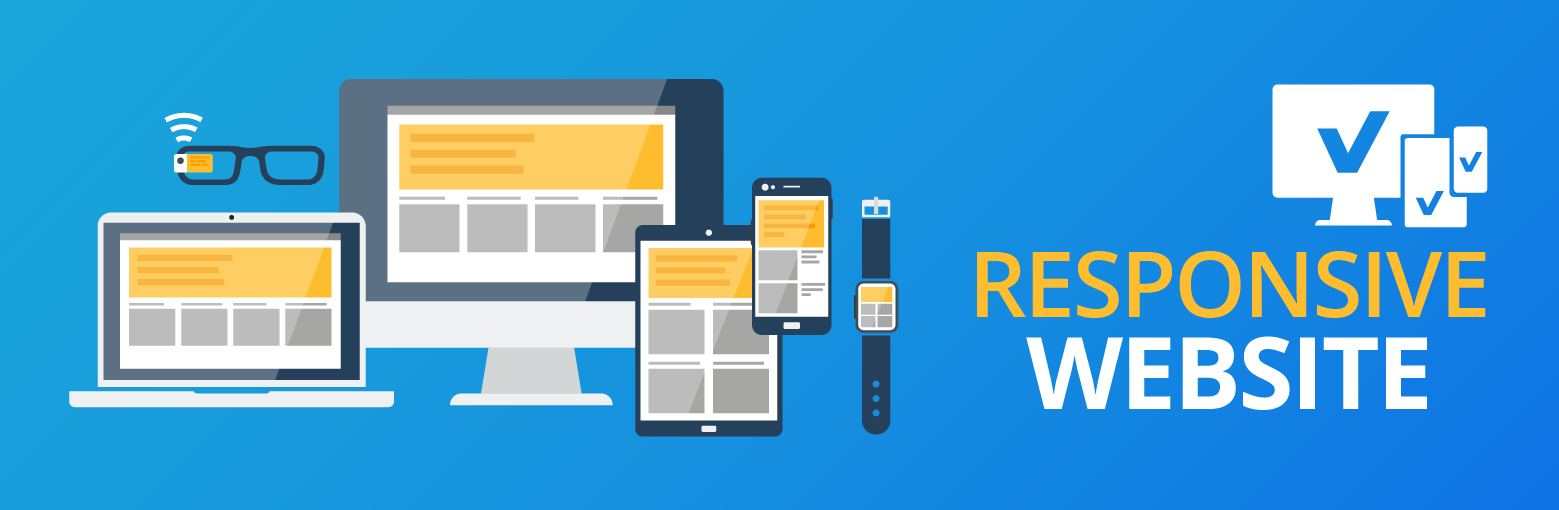 Make Your Website Responsive On Mobile Devices
The mobile web is growing at an incredible rate and will continue to do so for many years. More and more people are browsing the web using portable devices such as smartphones, tablets, “phablets” and game consoles. With these mobile devices becoming increasingly popular, your website must be mobile-friendly to compete in today’s world. To achieve this, you need a responsive website that can adjust to multiple screen sizes including those of the iPhone, Samsung Galaxy, iPad, and more.
Here at Internet Creation, we can build bespoke mobile websites that represent your business on these various platforms in a user-friendly way. Our design team are experienced in building and developing mobile websites that will allow your business to be well-represented not only on computer monitors, but also on all mobile devices that are available in the market today. Apart from being optimised for tablets and phones, we ensure that your mobile site is professionally designed and built to industry standards without compromising on quality.
By choosing Internet Creation to build your company’s mobile website, you can take advantage of some of the benefits that come with a responsive website. This includes:
- Potential increase in conversion rate
- Better connection with your customers
- Increased visibility on search engines such as Google – search engines love mobile!
- Lower bounce rates from customers who visit your website on mobiles as a result of improved user experience
- More traffic
- Competitive advantage over your rivals.
It’s a no-brainer, let’s help take your business to the next level with a responsive web design that meets your needs and requirements.